On Data Visualizations and Decisions

Visualizations can lead to awareness, and then to ???
When doing/working with researchers and data scientists, there’s often this “make it neat to interact with” bit which falls into the reporting side of analysis. And yes, it needs to be as intuitive/direct as possible to understand what the research/analysis has found, but also how it connects to what’s relevant from the viewer’s point of view.
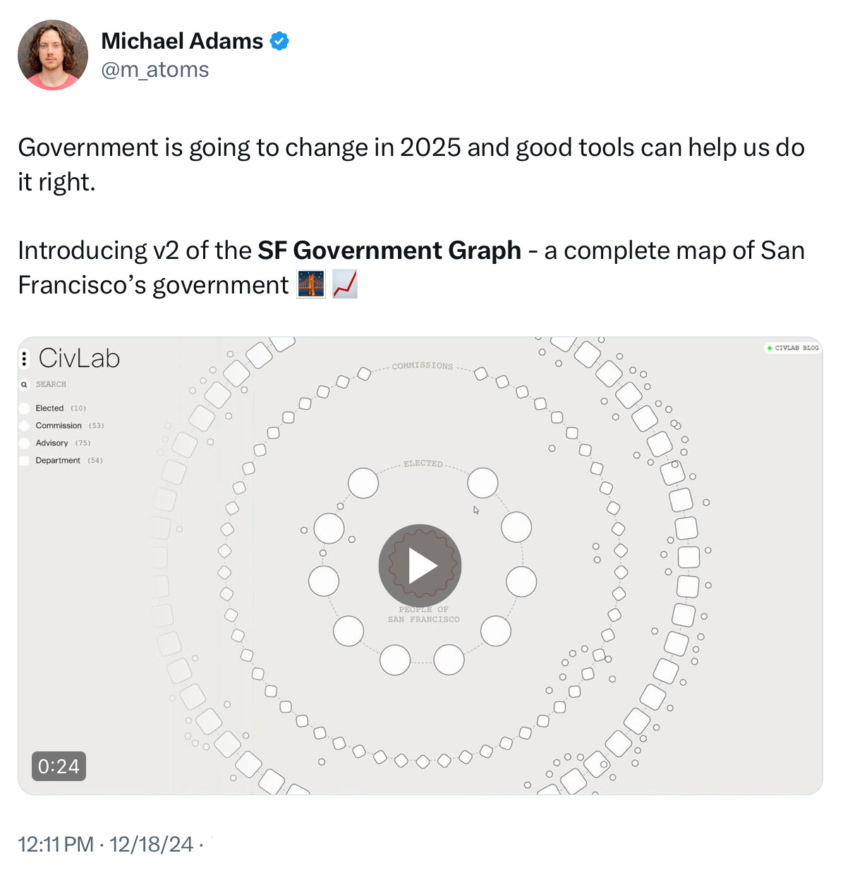
Can such views into the structure and decisions of government prompt a different response? Person over on Twitter/X shared a possibility under development called SF Government Graph.
Is the visual enough for the “interested” public? Yes. Is it enough to make, change, or invent new decisions? Not clear, not sure.
That said, if I were a social studies teacher, civics classroom, or committee/workgroup member for a government entity (I am the latter), such a dashboard would be hella helpful to see the kinds of connections between people, operations, and policy which validates the voices needed to keep, remove, or change decisions which affect our communities. This kind of #CivicTech ought to be more normally understood, wouldn’t you say?