Affordances and Sustainable Product Interfaces

Posted in the Muse Discord (5 June 24)
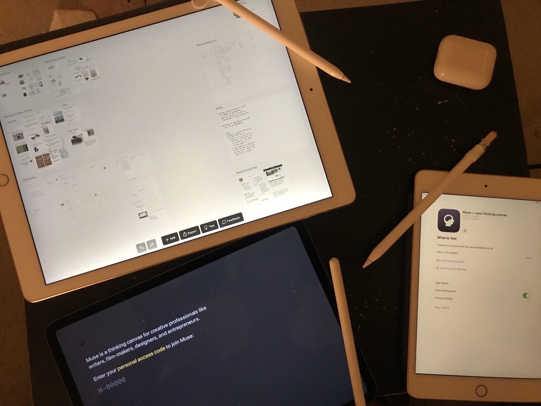
Every time I click the three dots (usually to change the title or do the connector) and launch into the object versus get the menu,I wonder “what would Muse have evolved to if it didn’t have pointer/mouse affordances like this as a first interaction, but as a toggle-able feature.” Would this been as discoverable if it were a tap-hold menu (borrowing from iPadOS’s press-hold-wiggle that happens with icons on the Home Screen or the platform’s better understood (yet sometimes still hard to find) tap-hold menu? I don’t know… I want to assume differently.
This thinking goes some/much into the “I use Muse on iPads almost exclusively, and in portrait mode. So I’m looking thru a lens of its tap, touch, touch-hold, and multi-finger gestural framing.” Certainly not the shape of how Muse has evolved, nor am asking for different (yet). But, for this long-time user who came to it in a large degree because it was designed for iPads first, and molded after its interaction principles, I notice those bits. I want to assume that much about interactions in this (and similar) apps has moved beyond “two fingers and a tool” but (eh, not a knock) the three dots, the sidebar, the toggled-menu, etc feel like it hasn’t.
Again, not really asking for a feature. More making an observation. Some of us truly do want to use more of what our digits are capable of in these, but is such an affordance sustainable to the product overall 🤔
Additional Thoughts
Many years back, a company - Ink and Switch - looked to move the conversation about tablet computers from “consumption” to “contemplation.” - for various reasons I don’t say productivity as they might have, or as others do today. In looking at what a canvas is best for, there was an approach to a product where the outcome was grounded more in focused thinking than it was some handed-off artifact. If you will, the thinking was the product, and your coming to conclusions on how/why/when/etc to do something was intersection with other platforms and outcomes. In exploring this, Ink and Switch also opined on the utilization of all of one’s fingers and the capacity of hands to simply do more than touch and drag. It encapsulated much of how I already felt about computing - that is, direct input is much more powerful than indirect input - and they eventually pushed forward with what became Muse.
Muse has evolved a good bit since its 2019 prototypes and release. It works on iPad and Mac (there’s a stub of an app for pushing content to Muse from your iPhone as well). There’s been a collaborative iteration (Muse for Teams). And much of it has simply evolved as Muse (the company) has as well. My feelings above are/were centered on Muse’s interface affordances due to such an evolution. It needs to be more usable by more persons, but in doing so, it pulls at what is familiar (touch, point, tap, viewable menus, etc.) and away from what isn’t (multi-finger gestures, additional actions with fingers and Pencil, etc.). This is normal for such a product, but am also wondering if it has to be?
Even looking at the newer pieces of hardware which have released, there’s little in terms of “do more than tap and push” with interface. There’s little towards pressure sensitivity unless one uses a stylus. The Humane AiPin does a push-pull-tilt with its interface - to varying degrees of success depending on where you are within this system. Off the top of mind, there’s not much else. Most novelty in interfaces is just two fingers touching a thing and that’s it. Capstone was an effort to push beyond this, but it doesn’t seem that the market beyond the niche of those who want/can learn how to use their hands more is actually viable?
Why isn’t it more viable? Is it the learning curve as compared to the population who can afford (time and resources) to devote to it - just using the word “devote” seems a bigger investment than “it makes doing (something) easier.” Is it because there’s not as much playfulness? Pinch and multitouch are much older than the iPad implementation, but the whimsy of how it was done made it attractive to use and adopt widely.
Or, the much less happy thought, it’s not viable because we have put fear of learning anew ahead of the comfort of measuring the old? Which, going back to “what does it take to make a novel product sustainable,” lends itself into the “novelty gets your attention, but the value is best realized in fostering normal expectations of experiences.”