Thoughts on iPadOS 16’s Stage Manager
Furthering some thoughts from last week’s Apple WWDC presentation of iPadOS 16 and Stage Manager. First, the thoughts on last week, also shared in last week’s Avanceé Reads:

Scribbling notes on iPadOS 16, and thinking of @MuseAppHQ
- run a Muse instance on an external display, but then getting a mini-map to navigate on the iPad (no mouse needed)
- extending the selection/marquee gesture to not only grab, but recognize/search or “correct to shape”
Mini-map would love where they current sync status indicator is (it would contain it)
- tap and hold to enlarge or send to Slide-Over/Side-by-Side
- no inking, read only (aka, a presentation view)
Ink Recognition
- step before making ink searchable
- convert to “type” before/while exporting as something of an option (computationally intensive maybe)
From the Mini-map, maybe then add the idea of boards becoming nodes (thinking of the Crosscut demo
This makes a mini-map not wedded to the vertical layering of boards, enabling something like “warp pipes” (Super Mario reference) thru one’s boards.
having thought a bit more
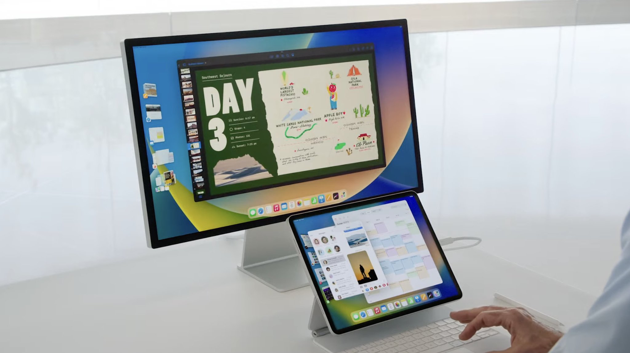
One of the use cases long wanted on the iPad has been that of connecting to a second screen and running one or more static or presentation-type applications (from PowerPoint and Pixxa Perspectives to MindNode, Muse, and a few others). Doing this would allow types of content, such as what is often shared weekly here, to be in a more permanent viewing space. In addition, there are many moments of working across applications where having multiple screens (not necessarily windows) would be advantageous. So, to this respect, Stage Manager mostly makes a lot of sense.
Where it was initially challenging is where Apple demoed it. It’s usage context was shown in the iPad being treated like a laptop. Which is one manifestation of work, but takes the direct-input shape of the iPad, and “tries to dress it in older clothes.” What would have been compelling from demonstrating it would have been a graphic designer’s iPad Pro, connected to a external monitor, and the designer with a controller (mouse, touchpad, or even the Microsoft Surface Dial), using the second screen as just that, a second screen. The demos all showed the attached monitor being treated as the primary - which makes sense for the context of “my laptop screen not being large enough,” but this shape shouldn’t be what’s pushed on the iPad in my opinion.
Such a showing would have challenged the current narrative of the tablet being “not enough like a laptop.” The shape of such a demo won’t change that overnight. But, it would offer a context of use (yes, pushing the generative, creative streams) which laptops have mostly left to being adapted to by keyboard, mouse, and other accessories. The iPad would still be a transforming canvas, however the focus on it being the primary interaction device would have made Stage Manager being just that, a staging space for what’s being generated on the canvas. Which, I believe, is more true to the shape of personal computing the iPad was meant to describe.
Which takes me back to the described bits about Muse. Here, Stage Manager is a staging space, similar to the original idea Muse had of an inbox. But, also able to (and pushes the person to) commit to interacting with the direct canvas intentionally, and the staged one’s indirectly. And, where these can be knit, Muse would be facilitating a kind of malleable thought-space, where it would almost be like a tool for thought with a place for the mind to be peered into.