Scribble and the Challenge of Input

On this, the day after the release of iPadOS 14, am engaging in a bit of an experiment to see how far and wide the Scribble feature has to go.
It is cool
But not polished…yet.
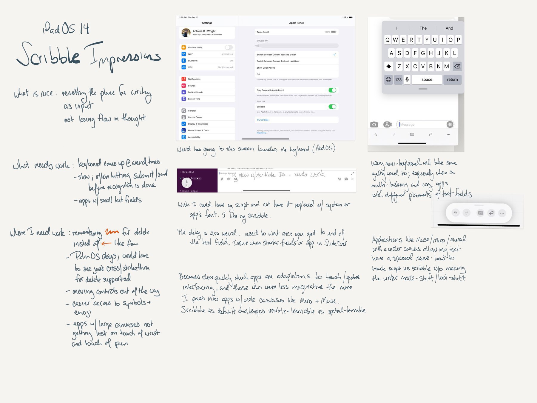
Once immersed in Scribble (for iPadOS), you begin to realize how some apps are mere adaptations of a indirect (⌨️, 🖱) UI, and others (better) embraced touch & gestures. The irony of scribble might be exposing an over-due investment in spatial UIs for multitouch thru using a pen
And weirdly, this is most clear in the micro blog app. Here, you get the right sized screen and spacious writing area, however you also get the keyboard which pops up unexpectedly. You also get the “I ran out af horozonttal space but now I write on another line” effect that is disruptive. Then there is also misspelling or that mix of print and cursive which leads to misspelled everything. Today, the editor takes the moment off to see if Apple took of it out a auto-correct job (the editor stays employed, with a raise).
There is a return to the immersion of handwriting though; which is pleasant despite the sound of plastic tapping on glass. This is a different kind of learnig how to do handwritten. Not too different from Palm and graffiti and not close either. There is immersion which can be had again in blogging with this.
There are more and better impressions in the attached. More things to not only discover, but refine in terms af usual us “sometimes " UI behaviors.
The onus is on developers to mature in their handling of input. And for Apple to be smoother about what exactly is capable when immersion and a morphing canvas really do open possibilities.