Auditing the Peculiar ID/UX Setup
Documenting and adutiing a peculiar (to some) way of working in the interaction design/user experience space

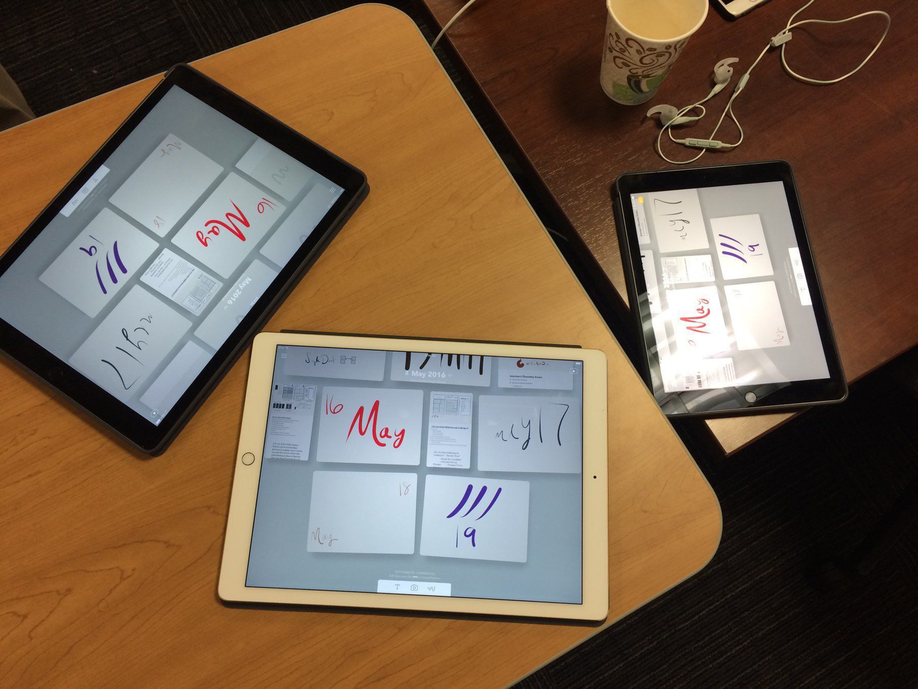
When using an iPad Pro as the primary workstation for experience/interaction design, the suite of tools and the workflow is just a little bit different than many. While a shock to some, its not an impossible endeavor. Though, using popular apps such as Sketch and Figma are out of the question. Replacing those with others, or figuring a way around what seems to be normative becomes part of the process also. At the same time, these applications really set the process for how experience designers translate and communicate their value. Fortunately, experience design is not completely dependent applications used.
It has been sometime since auditing tools and behaviors, and thought to share a piece of that exercise, listening for others’ tools and methods. This was shared with the Hong Kong UX Design Slack Group as part of a discussion on tools and methods.
Ideation
- Paper by WeTransfer (formerly FiftyThree)
- Evernote (unless client is Microsoft shop, would use OneNote/Whiteboard instead)
Wireframes
- Paper (low-fidelity)
- MindNode
- Adobe Comp CC (higher fidelity)
- Paste by WeTransfer (design deck)
Code/Interaction
- [Marvel App] (interactions, ability to use Handoff w/developers)
- [Textastic] (CSS, JS, etc.)
- Paste works often here too
- Apple Shortcuts (view source code of webpages, combine images, and a few other items)
Research/Testing
- Evernote (lots of narrative space, used alongside Penultimate; audio recording and asset collection; Shortcut integrationfor data collection)
- LiquidText (much easier to collect across content types than Evernote, however less collaborative)
- Excel (specific UX audit application: maps to Nielsen heuristic and project plan for stakeholder & project management buy-in)
You might have noticed a bit of simplicity with the listing here. Part of that comes from how a previous definition of UX (presentation deck) guides practices. This definition of user experience has become a bridge towards other audiences in defining expectations and deliverables. And as such, much of the way working on an iPad has evolved through this definition.
You might have also noticed a few tools previously featured on other posts mentioned here. Adobe Comp CC and Paper are mainstays to the creative process — snippets of screens show often in the Wednesday Concepts. Paste has endeared many to feeling similar to PowerPoint, but adding the positives of collaboration like Slack and others. Paper and LiquidText are probably the least collaborative of the tools mentioned. This is not a mistake, deep thought as a paradigm for work needs just as much mention as collaborative and coding tools.
Depending on the needs, the deliverable(s) takes several shapes. Paste decks, Apple Shortcuts, Google Forms, and reports have been the outputs of most of these activities. The shaping into those artifacts takes on the same routes. This is on purpose, consistency creates an avenue for efficiency. And in utilizing this specific tool and workflow, experience design becomes something closer to the initial thought than with other hardware.
Let’s stop there for now. So let’s hear it from any of you if you are using tablets, mobiles, or anything that isn’t a conventional Windows/macOS laptop as part of your ID/UX toolkit. Am always game for learning/playing with something new.